
- UI
- UX
Design on a big ass screen
What changes when you design for a smart TV: viewing distance, lighting, overscan, D-pad navigation, focus states and input.
· 11 min read
Foreword
As a pioneer in the smart TV market since 2014, LG has presented advertising campaigns with interesting statistics about smart TVs.
Fact #1: 53% of people are unaware of how much they can do with a Smart TV.
Fact #2: 75% of people think Smart TVs are too complicated.
They also proposed a way to improve these numbers by enhancing the UI/UX of their product.
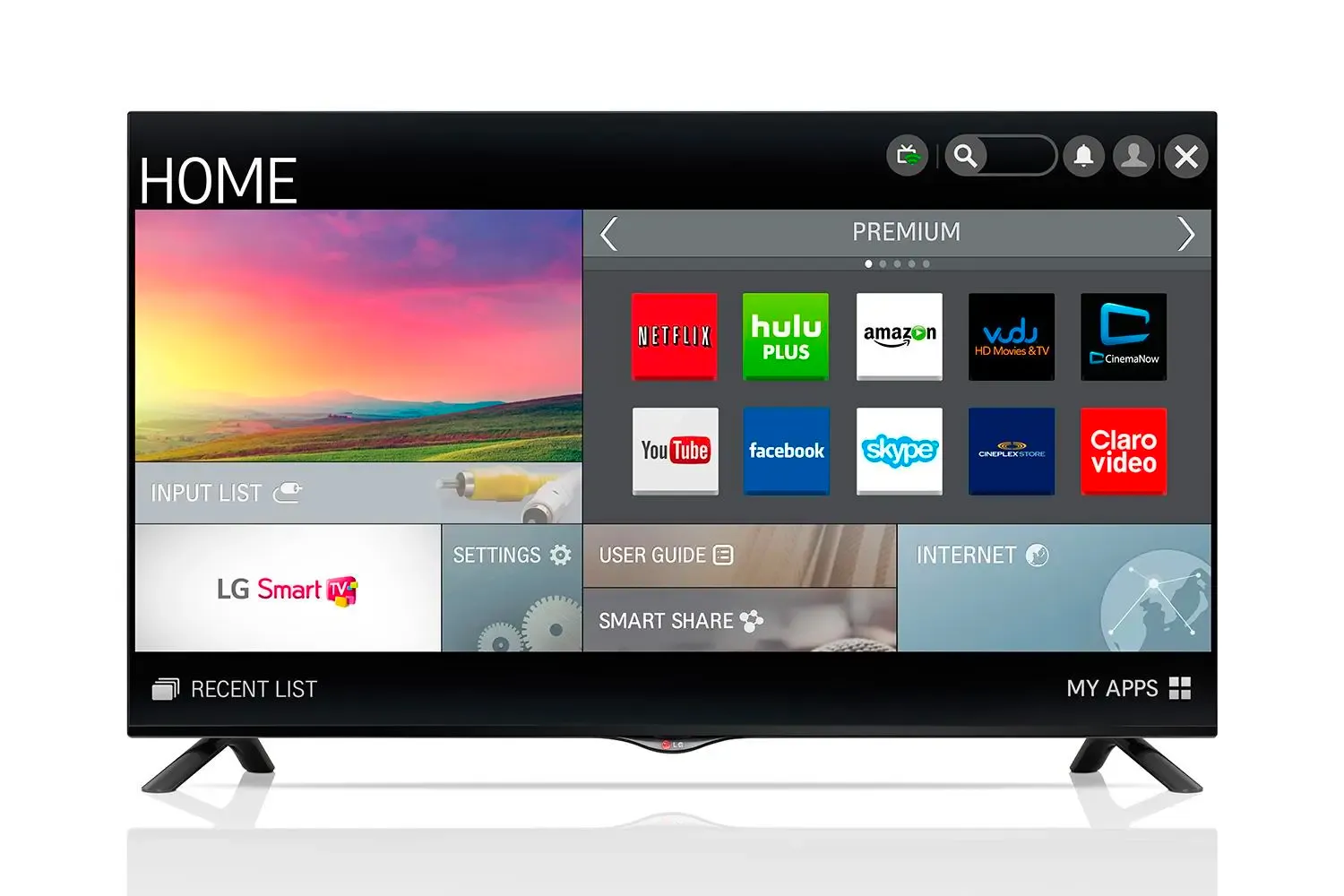
Unfortunately, LG failed to deliver a better usability, and its TV sales plummeted over the next two years. Frankly speaking, Samsung and Sony haven’t been able to solve the problem of smart TV usability either. Until today, designing user experience for new TV applications has only been considered acceptable with third-party apps.
Despite the fact that some TV manufacturers did publish design guidelines for their Smart TV systems, their documents cover only basic topics or date back to 2015.
So in this article, we are going to list things that we should keep in mind when designing app on a big ass screen.
How should we design it?
Design for TV requires a unique set of considerations
Some dude said so and curiosity killed my cat, I do some desk research and yes, it’s actually need a unique set of considerations differ from mobile phones, monitor screens and tablet stuff.
So what’s up with that?
That big ass screen is more likely in the living room
The fact that the TV is almost always located in the living room means two things:
- The room is very bright during the day.
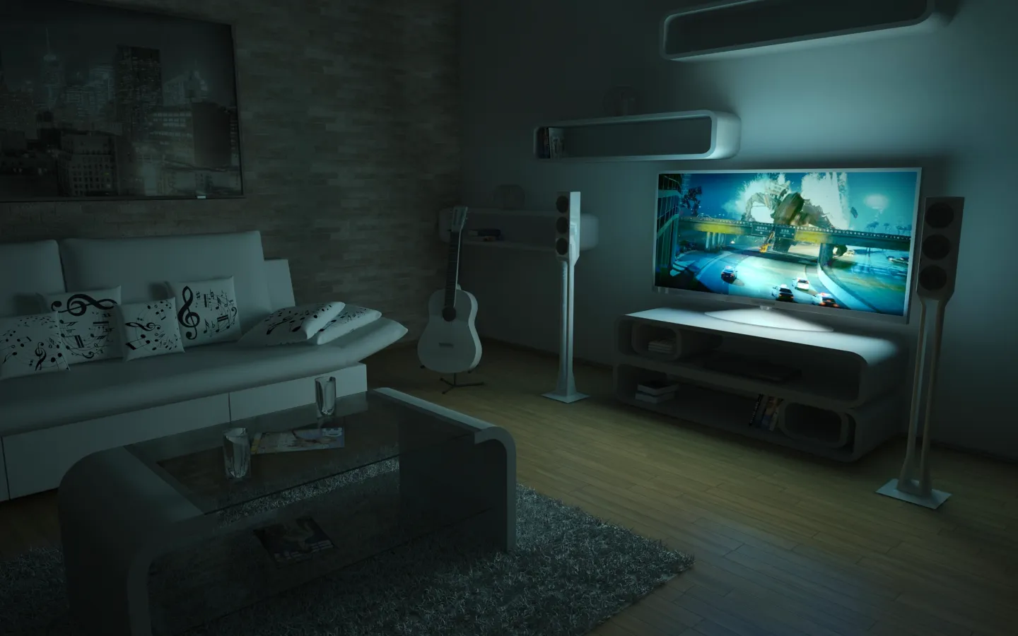
- The room can get pitch-dark in the evening.
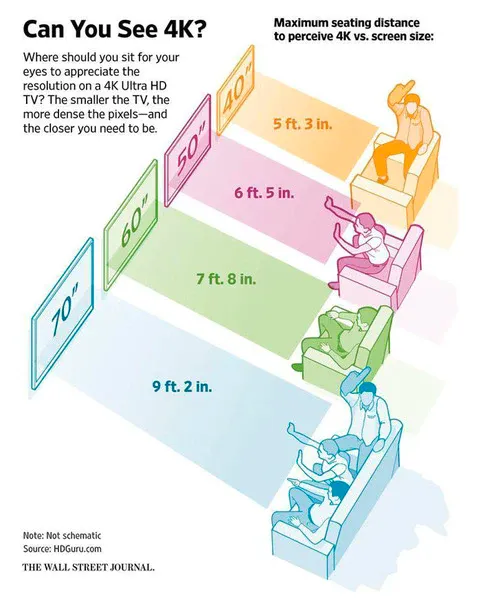
- The sofa can be placed anywhere between one to 10 meters from the screen.
But why are these things important from the UX perspective and what to do about it?
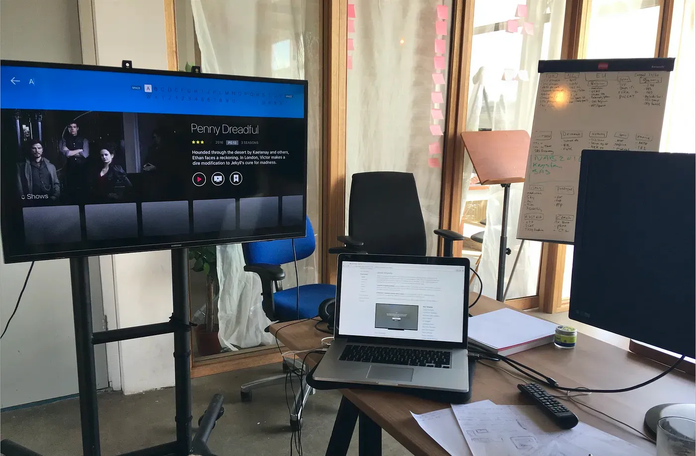
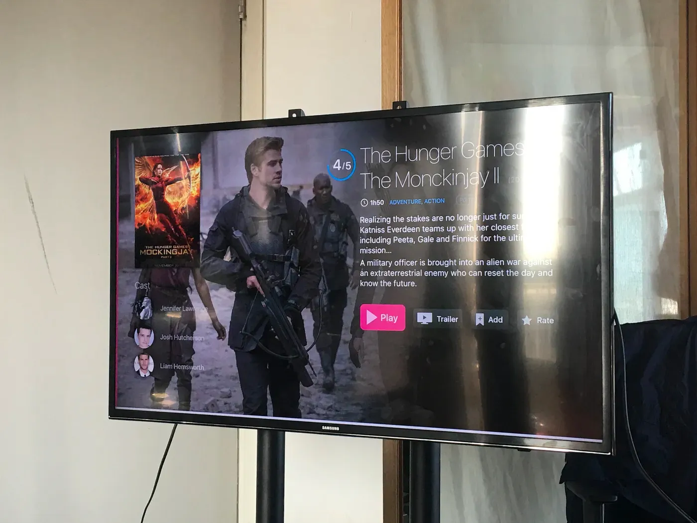
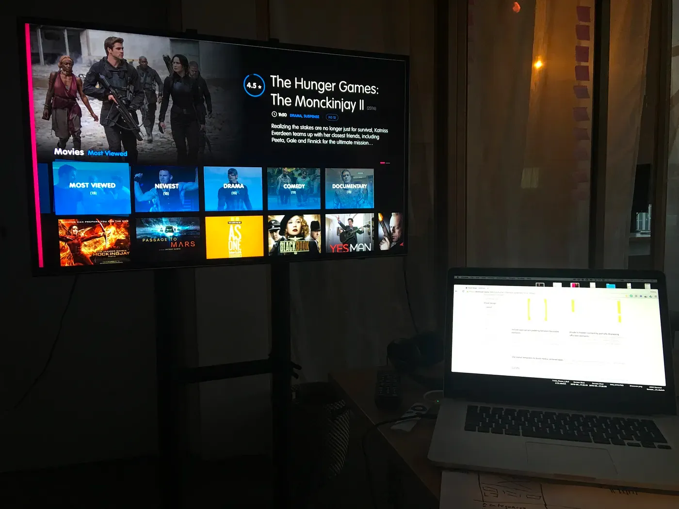
Direct sunlight and reflections can kill legibility. Use contrast to your advantage when designing the app. Make sure the interface is legible from many different angles and ideally test the app with different screen technologies and in different lighting conditions.
When choosing the colour palette for your app, consider the expected lighting of the living room, both in daylight and when the lights are off. Extremely high contrast won’t work. A white background will very likely kill your OLED, but even more so, it can make you blind when the room is very dark (yes oled tech can show very deep black and bright white while VA panel will alter colours at angles so keep that in mind). It’s not without reason that most popular streaming apps use interfaces with dark backgrounds and rarely use whites in excess.
Don’t hesitate of checking color palette against different TVs, because their color rendition may vary from screen to screen.
Size XS to XXXL
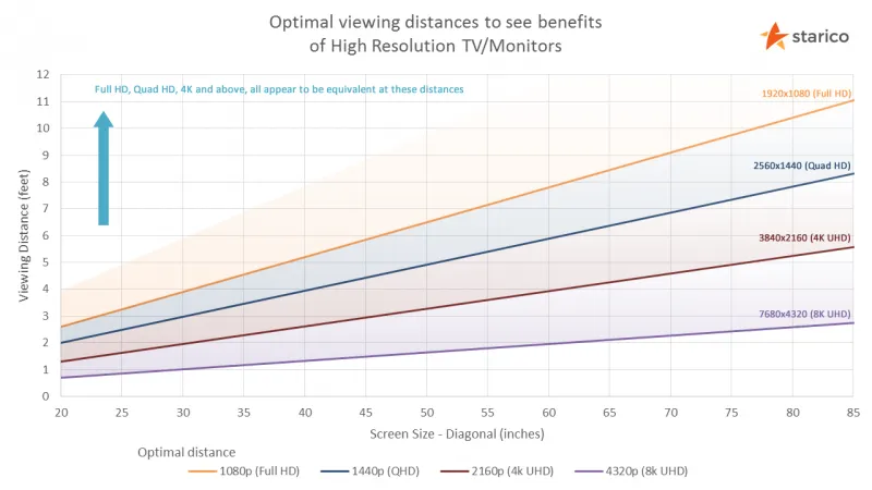
Unlike in laptops and desktop computers, TV screen sizes can wildly differ. This has to be taken into account when designing the interface — the fonts and elements of the interface must remain legible from a meter away as well as from four meters away. So increase font size and weight is the first thing, the second thing is to reduce the amount of them.
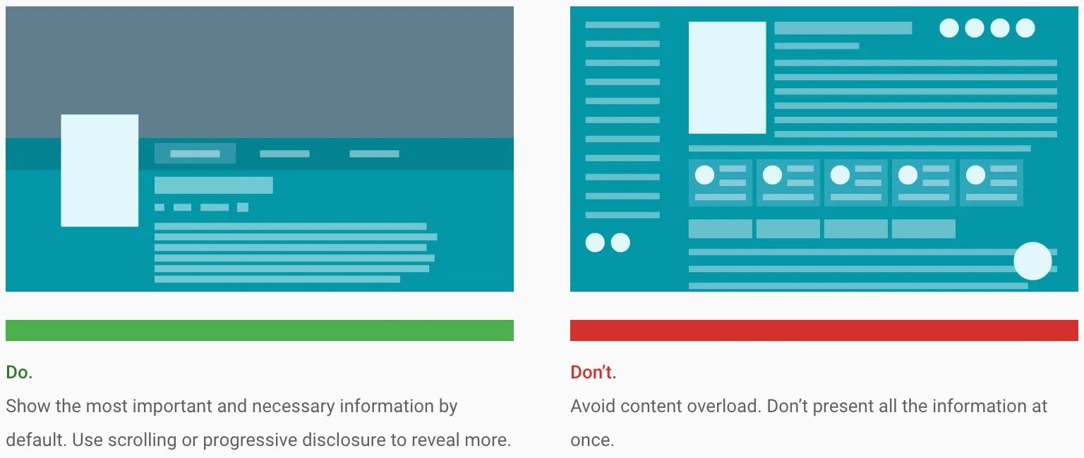
Resolution and viewing distance can make it difficult for people to process too much information. Try to keep your design clean, reduced to the simplest possible components. The amount of information displayed on a TV should be comparable to what you’d see on a mobile phone, rather than on a desktop. Limit the amount of text and reading on TV screens.
While screen size may differ from device to device, the international standard aspect ratio is agreed to be 16:9. The app is usually designed in 1920x1080px screen size, then all elements can be easily resized proportionally for HD or 4K screens.
If you use .JPG, .PNG or videos within the App-UI, remember to provide them in double resolution for 4K screens, so they are displayed in the highest possible quality.
Safe zone
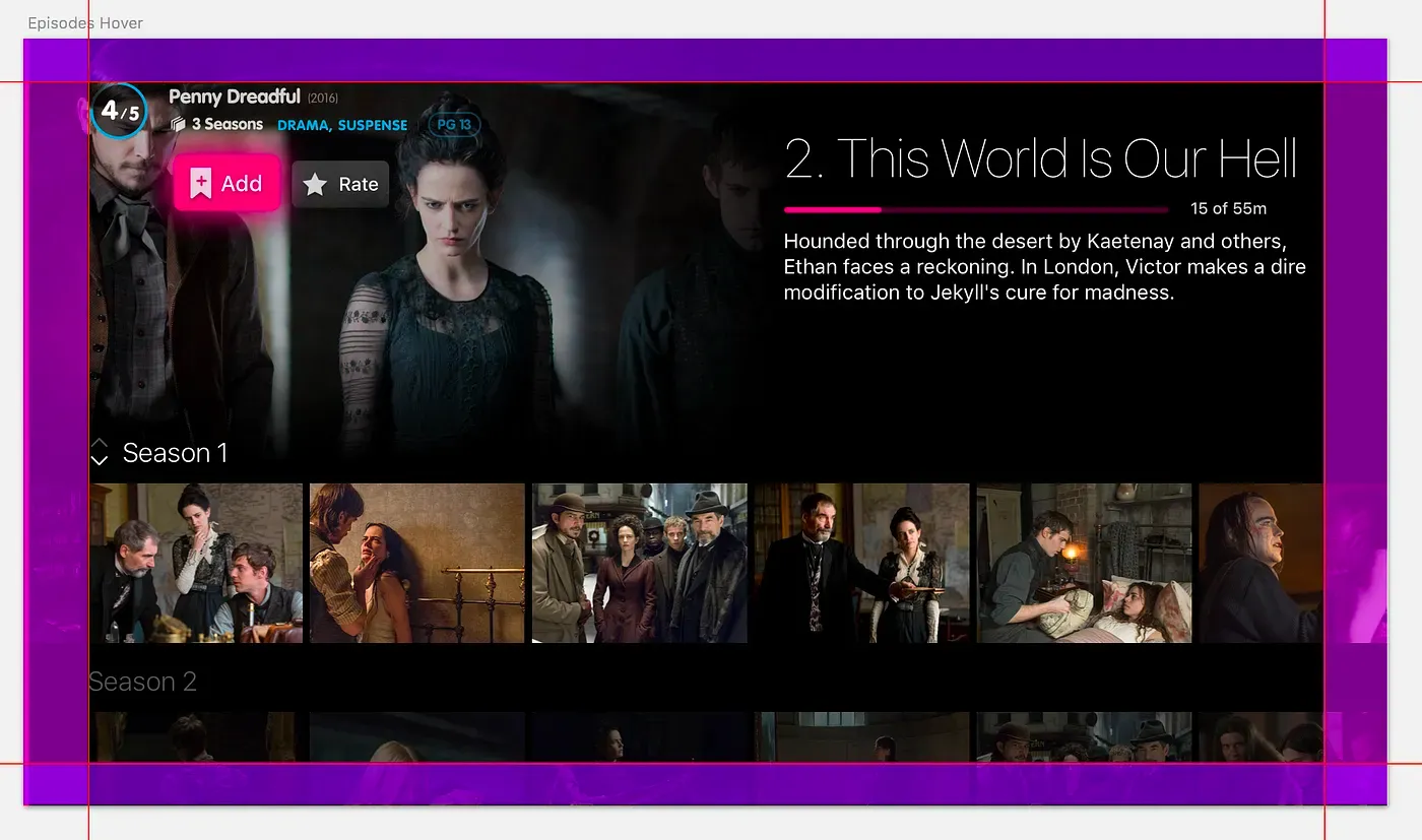
Due to overscan, not all TVs display content all the way to the edges of the screen, causing the edges to overflow off the visible screen area.
The first TVs on the market were made of cathode ray tubes (CRT), a clunky technology that produced inconsistent images across TV sets. This issue was particularly bad along the edges of the screen, so to compensate, CRT TVs were subject to overscan. With overscan, the image itself is enlarged slightly so the edges are outside the bounds of the viewing area.
Google Android TV, Apple tvOS and Amazon Fire TV set different safe areas guidelines to avoid overscan, but they all keep at least a 5% margin to define a generally safe area.
Google and Amazon Fire TV guidelines suggest you keep the 5% margin into your TV screen designs to account for overscan area. On a 1920 x 1080 screen, this margin should be a minimum of 27 pixels from the top and bottom edges and a minimum of 48 pixels from the right and left edges of the picture.
Apple tvOS is a little more generous and suggests to keep an area spanning of 60 pixels from the top and bottom of the screen, and 90 pixels from the sides.
Navigation
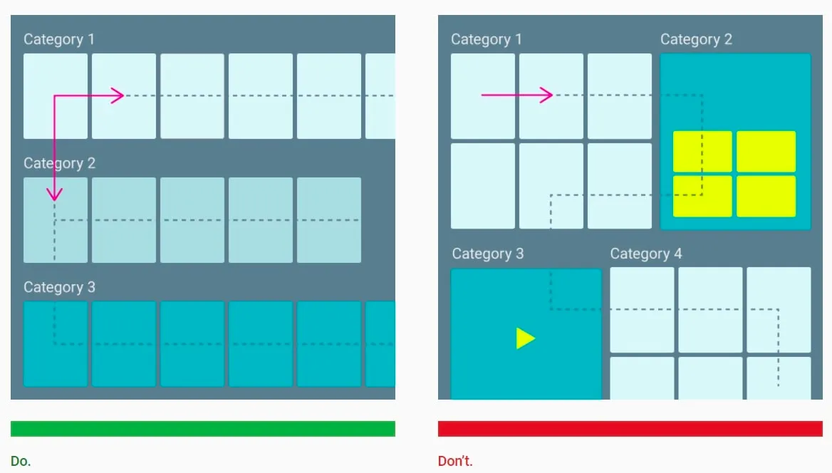
Hardware often defines design patterns. On mobile, tabs emerged as a navigation pattern given the small yet tall screen size. On TVs, the wide yet squat canvas lends itself to long rows of content that maximize the amount of content visible. Like tabs on mobile, this pattern has become commonplace on most TV streaming UIs.
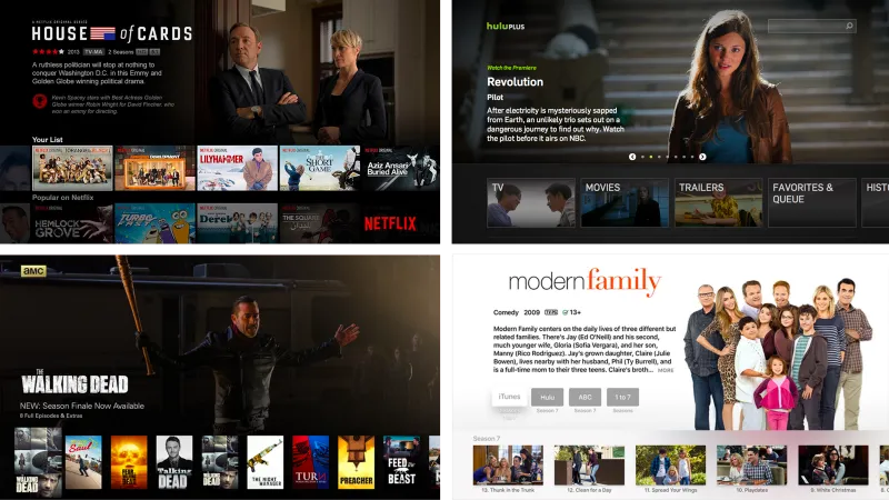
Smart TV navigation should be designed to offer the shortest possible path to content. This basically means applications should not make the user go through numerous screens before reaching the desired content. At the same time, every screen should follow a consistent design and be simple to operate with an input device.
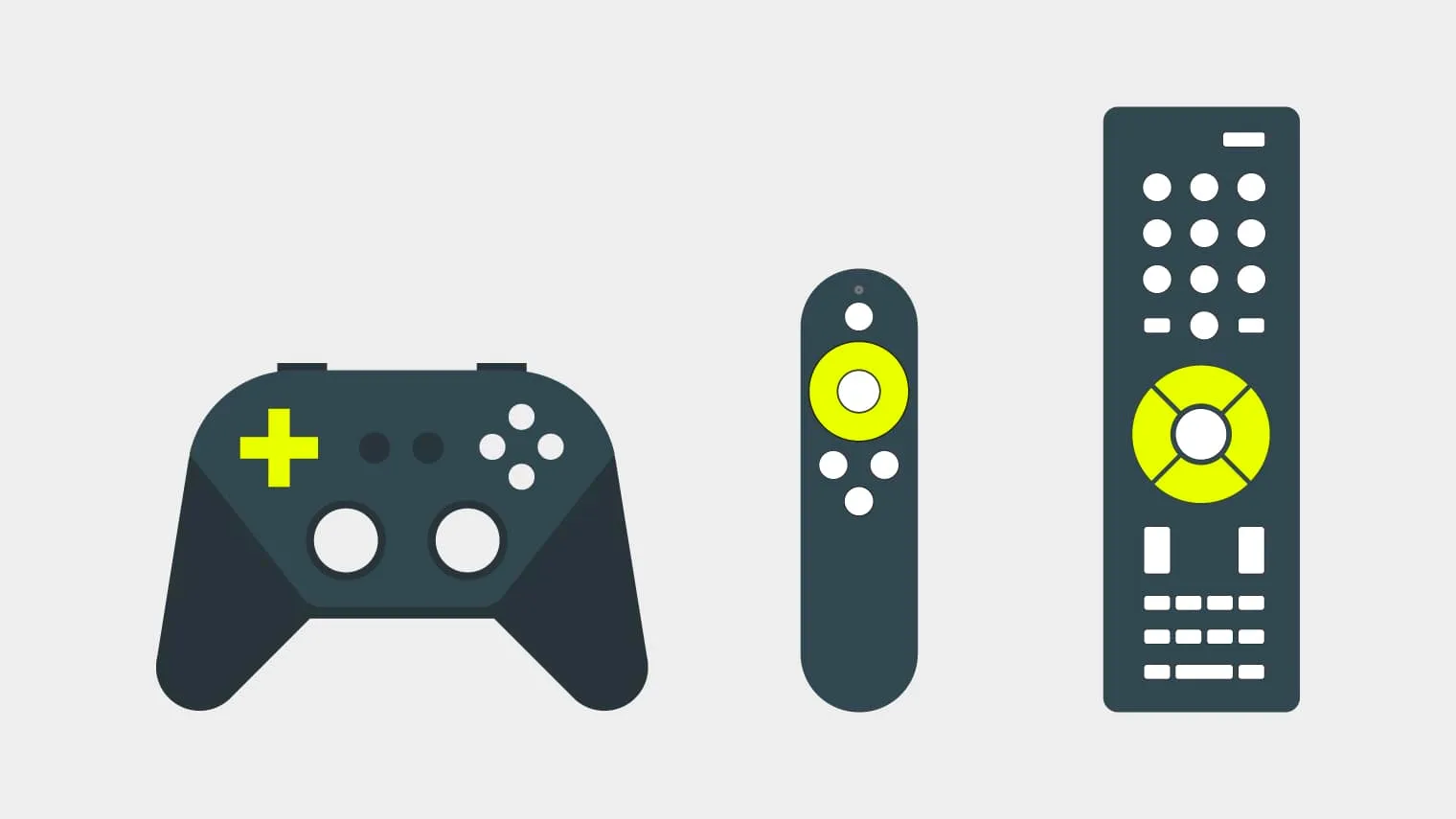
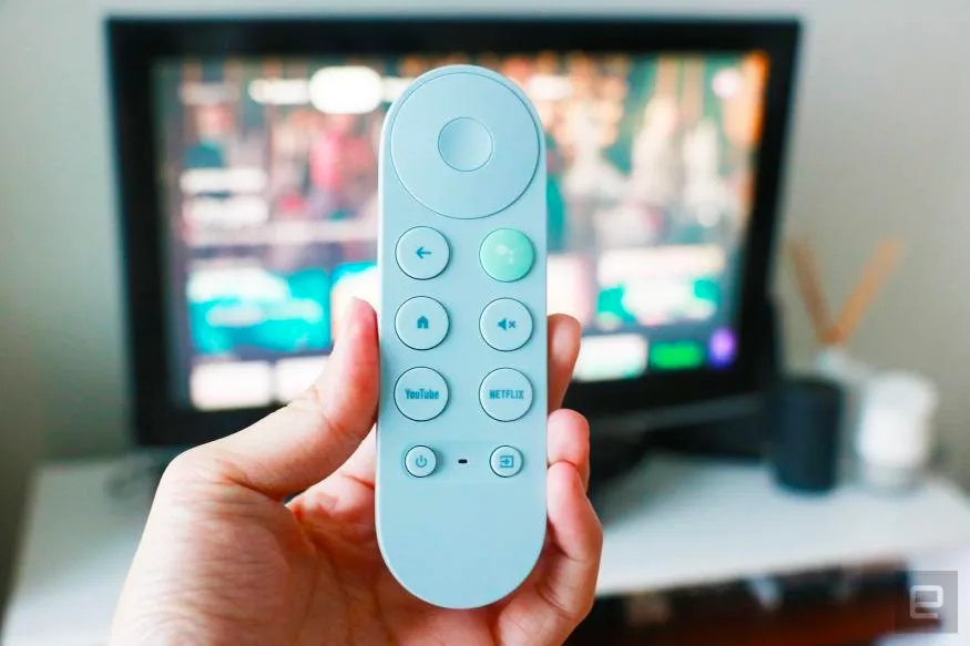
TV manufacturers are going out of their ways to come up with new, more intuitive, and innovative remote control devices. Gone are the days when remote controls were just dull, rectangular blocks of plastic with dozens of mysterious rubber buttons on top. Today’s remotes are more intuitive and pretty minimalistic. However, all smart TVs invariably have one thing in common: there is always a D-pad with the “OK” and “Back” buttons.
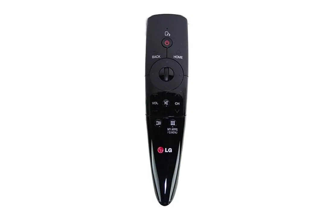
Most users expect these “standard” buttons to work the same way in each app. To save users confusion, make sure your UX design complies with this expectation. (User expect the Select button selects item focused on the screen, Home button takes user to the Home screen, etc.)
Navigating on a smart TV should be as easy as possible. Remember that users will navigate the app without a touchscreen. Design your layout with this in mind by taking advantage of the d-pad.
Focus state
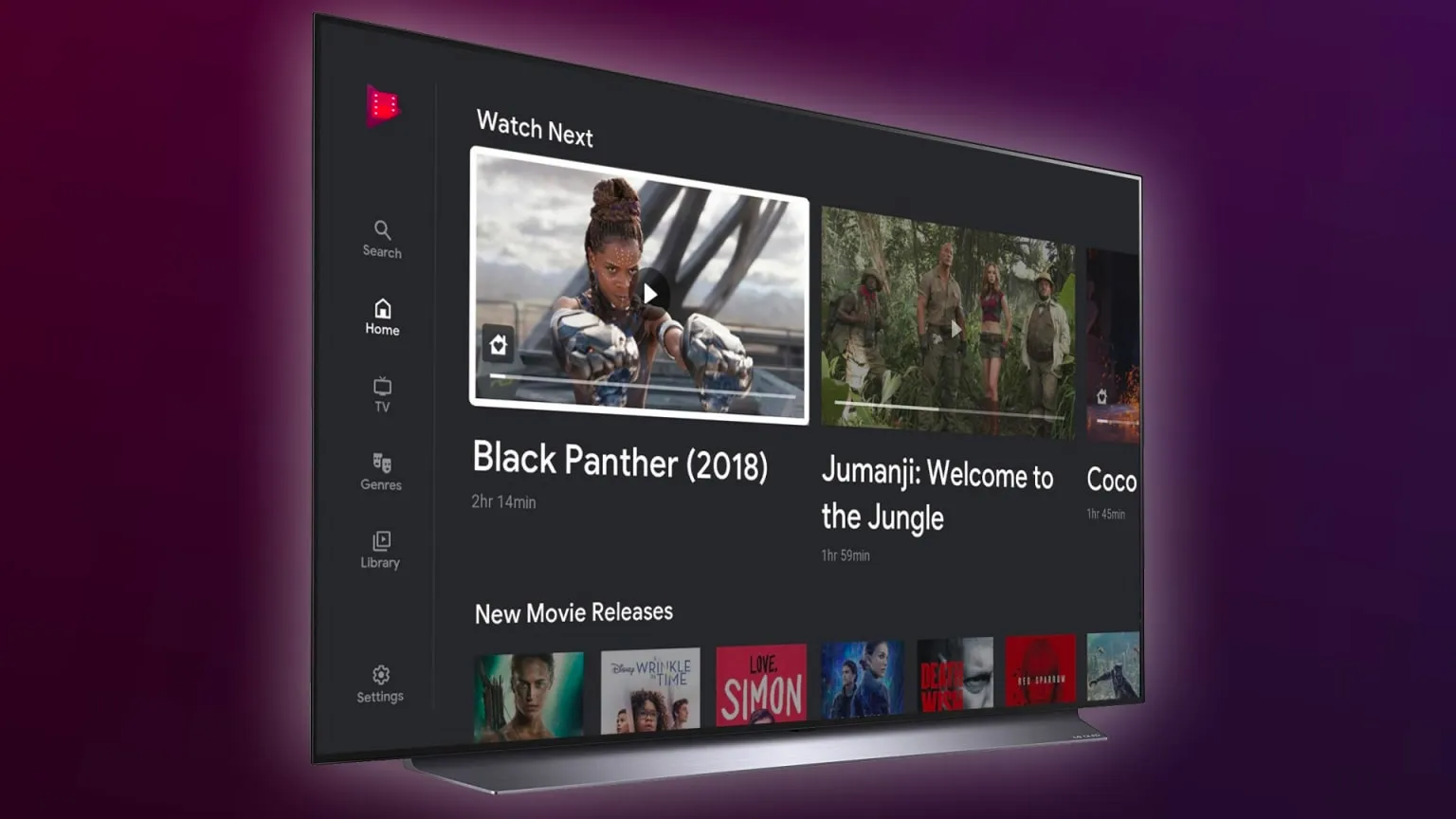
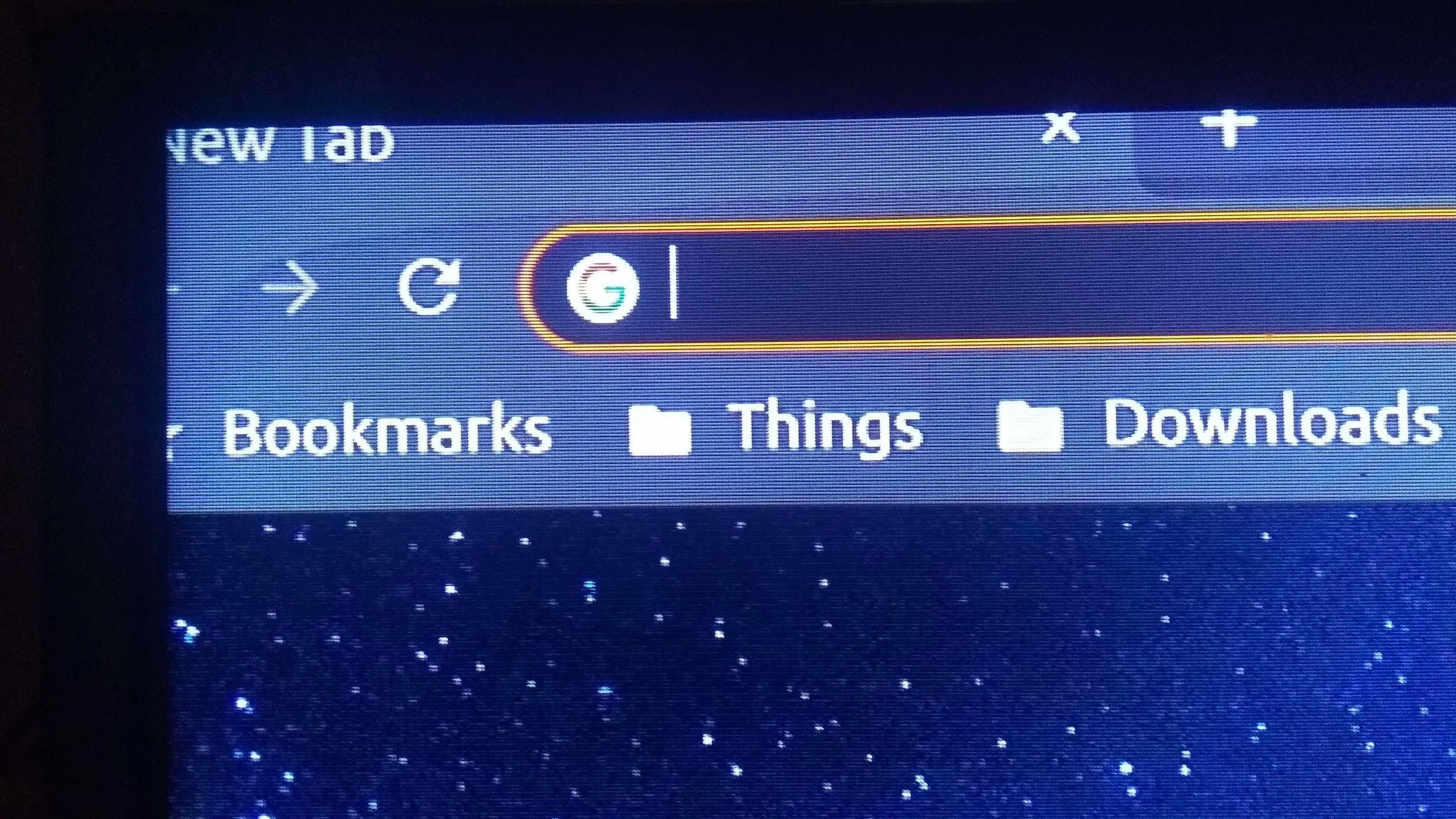
Because there is no mouse cursor or touch input on the Smart TV screen, the interface must also implement something known as the focus state — at all times, it must be made clear to the user which element is currently in focus, usually by highlighting the element or adding a different-colored border around it (see example below).
- Give user visual feedback on focus changes by displaying a transition between focused and non-focused states.
- Use different sounds to provide audio feedback when focus is changed, and an action is selected.
Input methods
Beside typing on virtual keyboard with TV remote (which is a real pain, time-consuming, tedious that we are all suffering), there is several input methods that use to “typing” on TV:
- Voice control: This may not be supported by certain devices and there is a higher risk of errors, as it may not recognise speech properly.
- Control mobile apps: This have become popular, using a mobile keyboard on a personal device. This is an easy solution for one to control with a mobile device.
- Physic keyboard: This is the most natural way of typing but it requires a keyboard and not so much convenient.
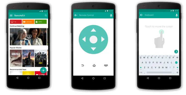
Typing on TV is a real pain-in-the-ass so what can we do to minimize these complicated and clumsy inconvenient?
- If you really require the user to input something, make it as easy as possible for the user. For example, it can be done by showing the user word suggestions that guess the film titles before they even realize what it was they were looking for.
- Offer an external login process — allow the user to use the mobile phone. But first and foremost, make sure the system remembers usernames and passwords and minimize how often the user needs to type anything in the first place.
Device Manufacturer Guidelines
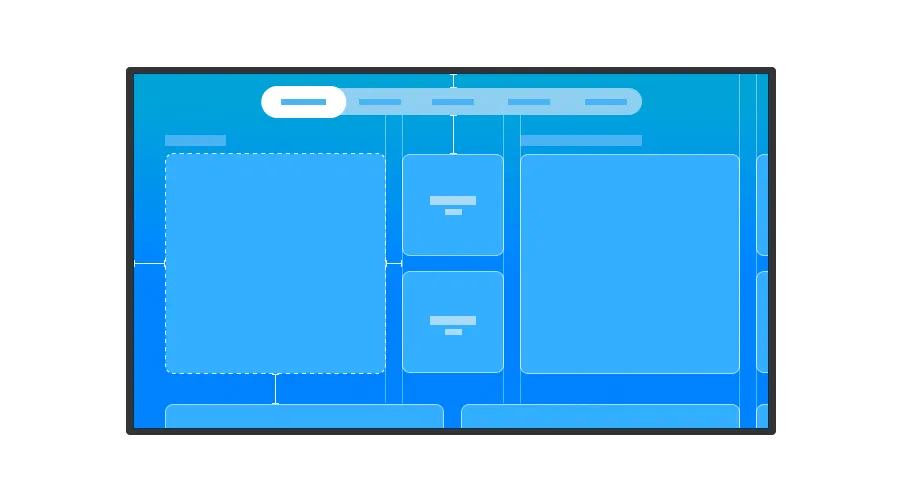
These guidelines provide a basic understanding of the TV experience, tech specifications, as well as design recommendations for specific screens. Device manufacturer mandatory checklists must be followed to ensure that your application is accepted and certified to be on an app store.
Lastword
2k and 4k TVs (16k exist!) are common nowadays and gradually replacing old screens and gain greater user base. Content producers and media companies are heavily investing to make sure their smart TV applications. The design and performance of the app can make or break its success. In the increasingly competitive streaming industry, there is just no space for poorly designed and badly performing apps.
Let’s re-remind you with all the points I have listed above
- TV usually in the living room → Use contrast, double check colors (and don’t flash user).
- TV have large screen → Text must be legible, reduce to simple components, limit amount of text.
- Overscan → Add 5% safe zone.
- Reduce memory load and motor load because of D-pad → Shorten navigation path, don’t change basic button behaviour.
- No mouse cursor → Visual feedback when focused, audio feedback when navigating.
- Bad input methods → Add suggestion words, remember username and password.
- Don’t know how to do it properly? → Check manufacturer guideline
Info
I want to thank all these people/group for their amazing work
- Andrea Pacheco for TV Guidelines: A quick kick-off on designing for Television Experiences
- Norigin Media for 10 Tips for UI/UX Design on Smart TV
- Altamira team for How to Design UI/UX for Smart TV apps
- BSGroup.eu for Tips for UI/UX Design on Smart TV
- Molly Lafferty for Designing for Television – TV Ui design
For further reading
- developer.amazon.com/docs/fire-tv/design-and-user-experience-guidelines.html#10-foot-ui
- tv.withgoogle.com/design-principles/designing-for-tv.html
- developer.apple.com/design/human-interface-guidelines/platforms/designing-for-tvos/
- developer.samsung.com/tv/design/design-principles
- sketchappsources.com/free-source/2146-android-tv-ui-sketch-freebie-resource.html
- toptal.com/designers/ux/ux-designer-portfolios
- toptal.com/android/developing-for-android-tv-big-screens-are-coming-get-ready