
- UX
Banner blindness
Why users ignore anything that looks like an ad, what eye-tracking research shows, and how to keep real content from getting skipped.
· 7 min read
Define
Banner Blindness is a well-known behavior, its the tendency to ignore elements on web page that the user assumed (true or not true) is an advertisement.
The design of websites and type of ads is changed throughout the years, but this behaviour is still persist
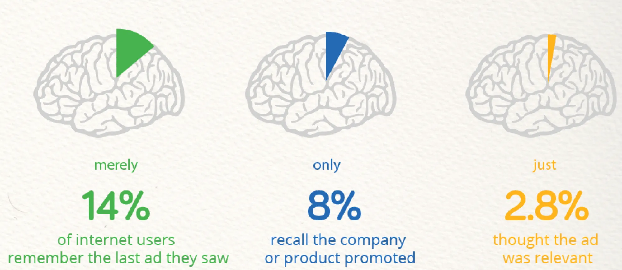
Banner blindness is evidence of selective attention: humans direct their attention to sets of attention stimuli in the environment - often things related to their goals.
This behavior is a result of limited attention capacity. If we were to pay attention to every sound or image around us, the brain would become overloaded and operate inefficiently.
On the web, design elements at different locations compete for the user’s attention. To accomplish their desired tasks, users often learn to focus on useful elements (navigation bar, search box, headlines) and ignore those without informational value → skipping advertisements.
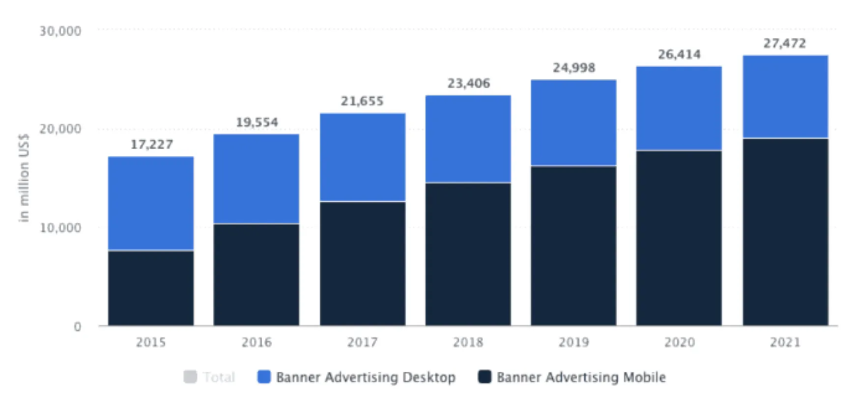
Content that mimics the appearance of advertisements is also disregarded. Here are some signs indicating an advertisement:
- Advertisement placement: At the top or on the right rail
- Advertisement-like appearance: Animations, gif images
- Proximity to advertisements

Location
Ignoring advertisements is a learnable behavior (similar to the example of searching for a company’s logo in the top-left corner of a page or looking for the navigation bar at the top). Through eye-tracking studies, users have learned to overlook the ad section at the top of Google Search, even though it is designed differently from regular ad banners.
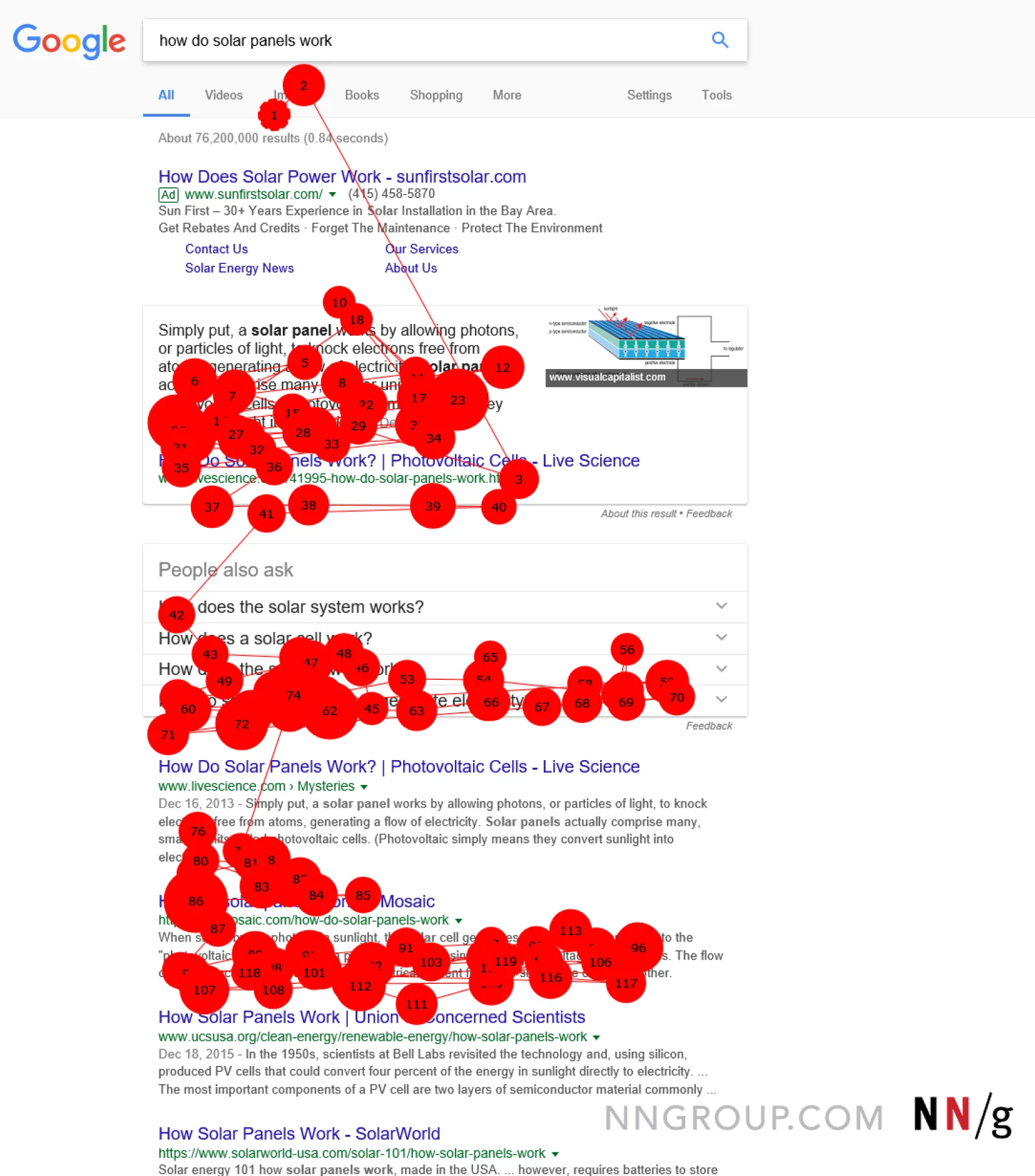
Because desktop advertisements often appear at the top or in the right sidebar, web users sometimes overlook content placed there.
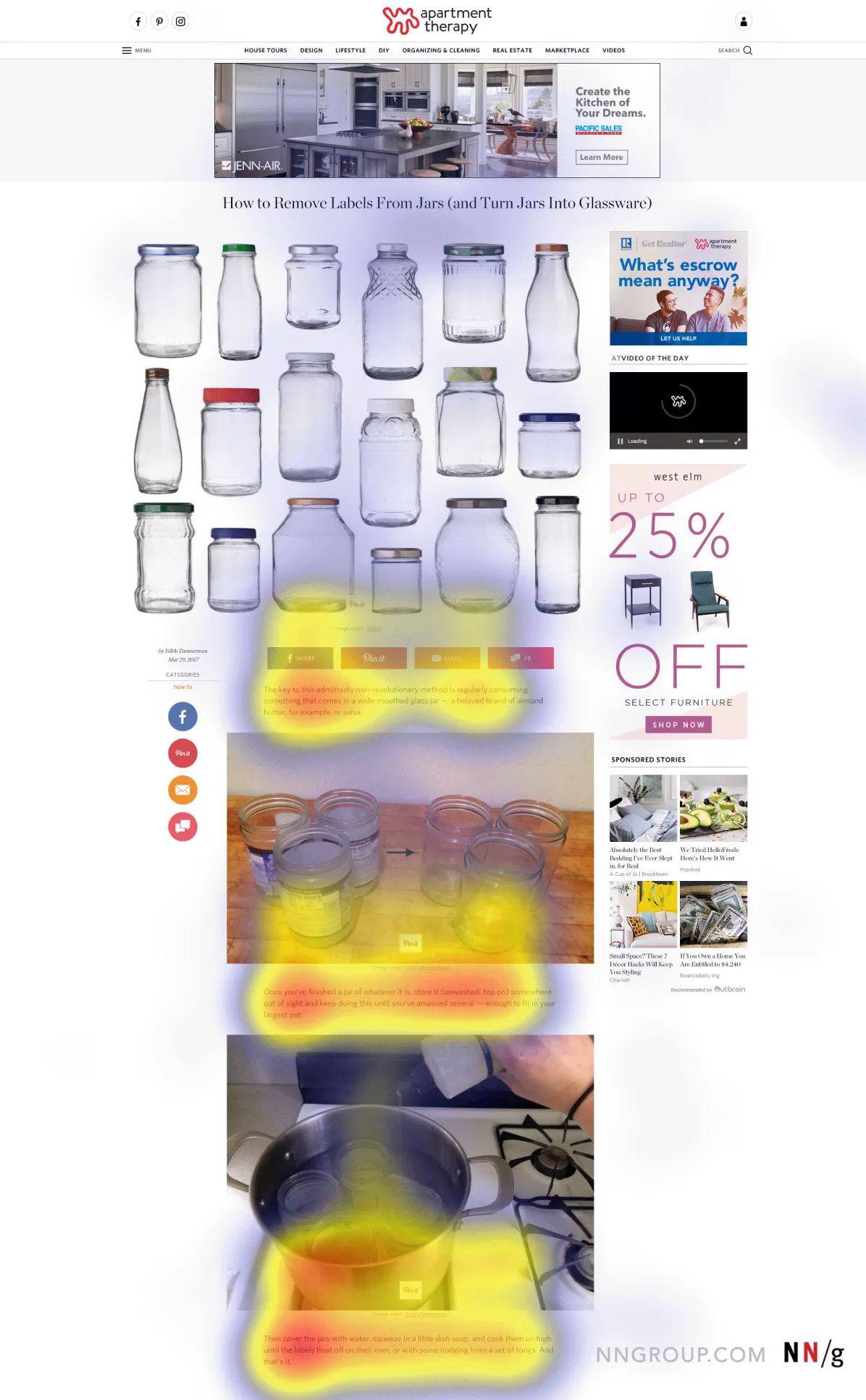
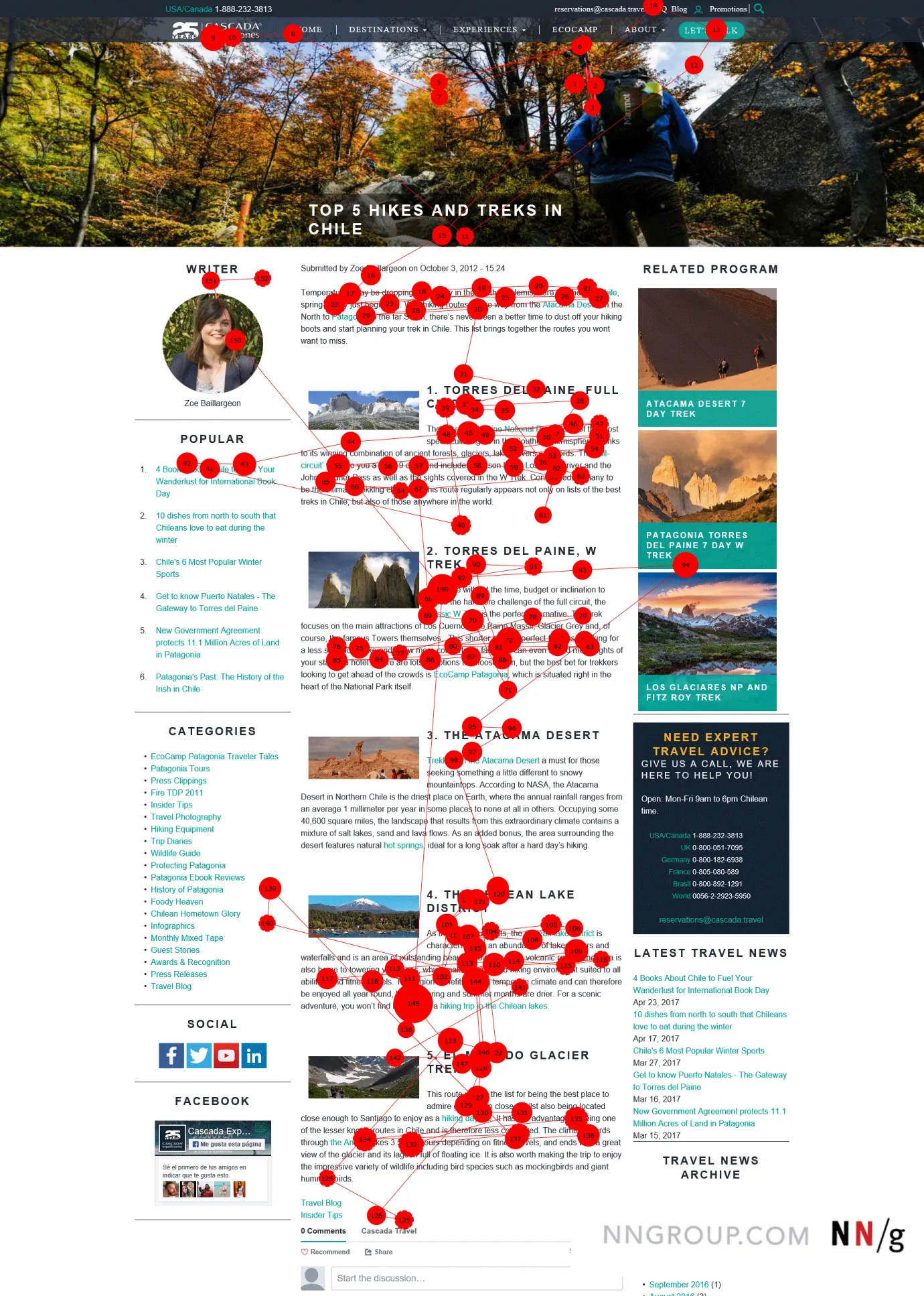
In the most recent eye-tracking study, 26 participants accessed the same webpage while performing a task to find the best method for removing labels from bottles. The page included a small amount of text, some images, and advertisements at the top and on the right sidebar. Users read the text on the page, but they looked very little (if at all) at the advertisements.
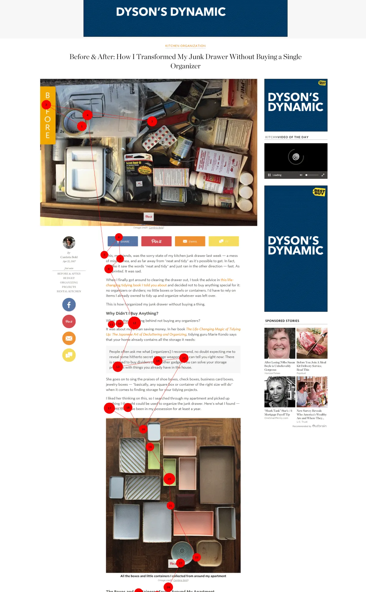
In this gaze plot from www.thekitchn.com, the participant didn’t look at ads in the top banner or right rail as he researched organizing his kitchen.
Visual treatment
Advertisements don’t necessarily have to appear at the top or in the right rail to be disregarded. Advertisements nowadays can be situated anywhere on a webpage, and users are aware of this reality. Hence, they are cautious not to invest time in ads, even when ads are placed within the content area.
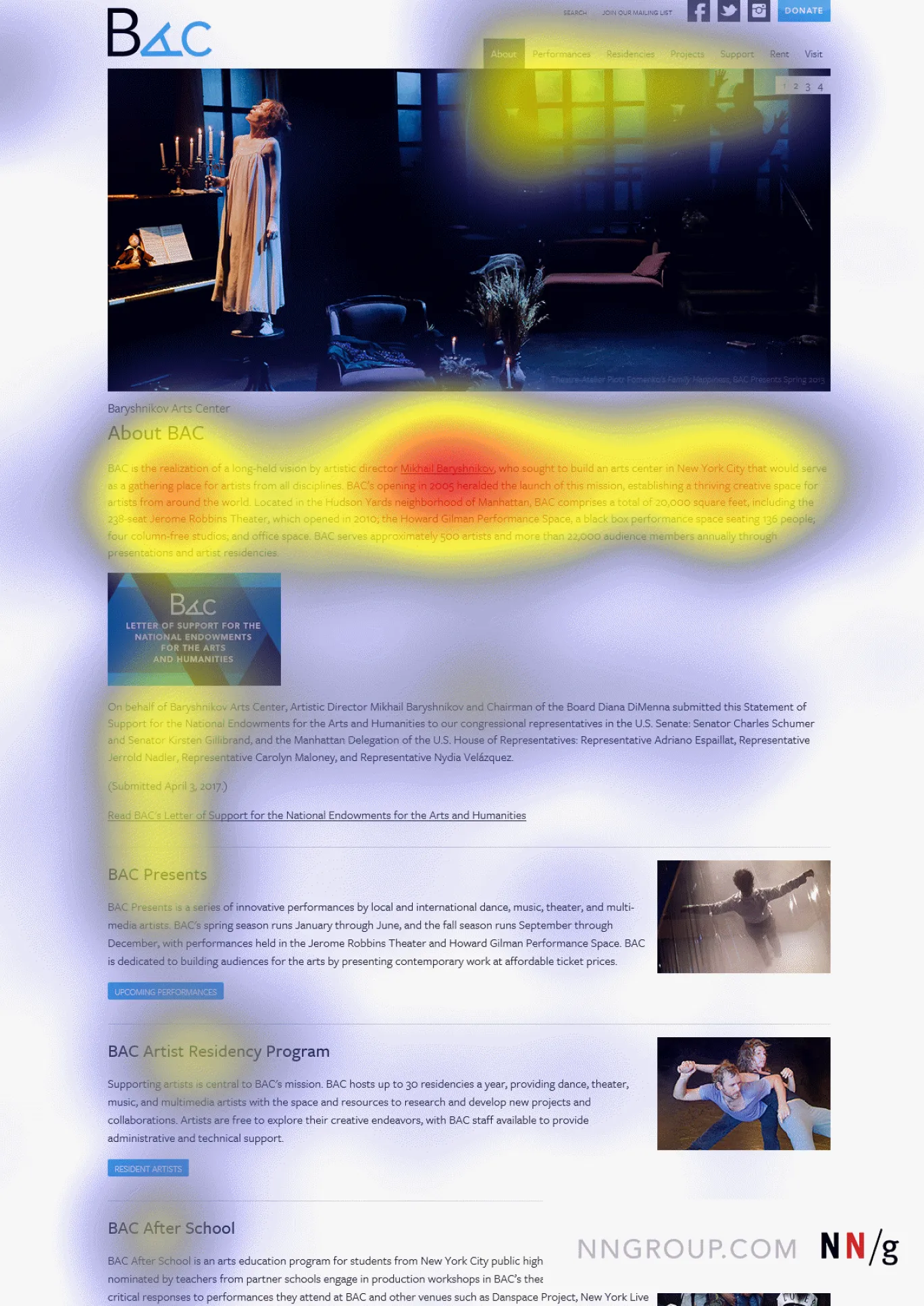
On desktop, in-page advertisements are relatively easy to overlook because they stand out significantly from the surrounding elements. For instance, in a recent study, 26 participants seeking information about Mikhail Baryshnikov’s dance training course ignored an advertisement embedded in the text. What might be the main reason behind this?
Advertisements look distinct from the text and images on the webpage.
In particular, advertisements stand out due to several factors:
- Small, square shape in the midst of text
- Distinctive font format
- Prominent (blue) color against a white background
- Text within images
These elements alert users that the square box is an advertisement, allowing them to confidently overlook it.
Proximity to ads
Content placed within the same screen area as advertisements is often perceived as advertising and is also disregarded. This is a straightforward consequence of well-known principles:
- The Proximity Law of Gestalt: Objects that are close to each other are assumed to be part of a group and therefore functionally related.
- When people view different items in a screen area, they form a psychological model of the available content based on the information from those items. Hence, if one of the items appears completely unrelated, they typically assume the entire section is irrelevant to their goal and will cease to view the remaining items.
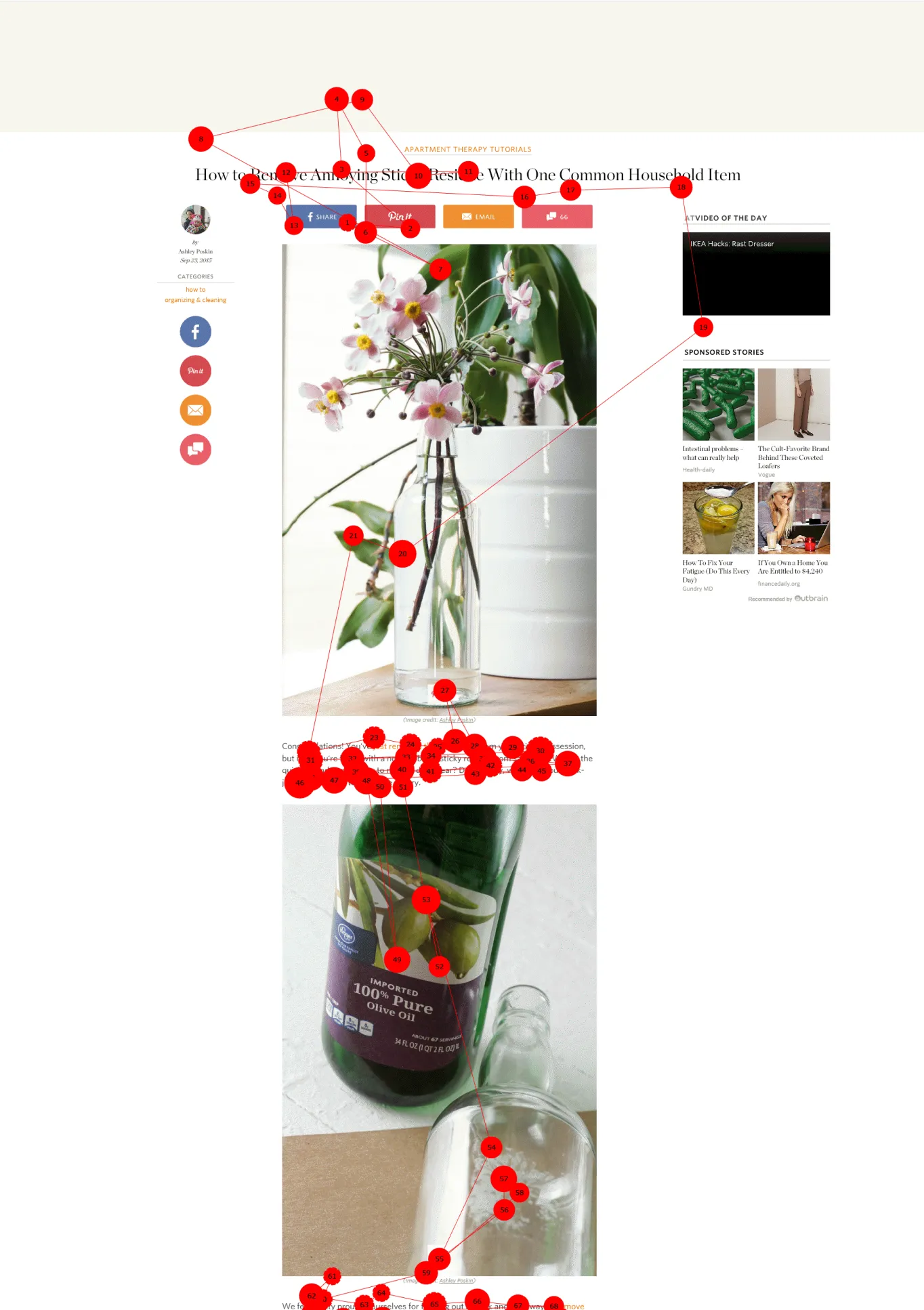
A participant in the study was learning how to remove bottle labels by only looking at the right rail once, possibly determining that it contained only advertisements. The right rail actually contains sponsored listings, but it also features entertaining videos and helpful tutorials on various DIY projects.
Hot potato
As seen in the example above, advertisements can cause users to divert their gaze from an area and not return to that area. Such an experience can not only alter their local behavior on that specific page but also influence their overall web behavior: they might avoid viewing the same area on other pages or even on entirely different websites.
This is an illustration of the hot potato phenomenon. The metaphor of a hot potato stems from a game the author used to play in elementary school.
Definition: On the web, the hot-potato scanning pattern occurs when users fixate on an element they are not interested in, then quickly shift their attention away and avoid focusing on that area on that page and sometimes on other pages on the same website, and even on entirely different websites.
The hot-potato behavior is a self-defense mechanism to avoid wasting time and attention on irrelevant elements. However, this anticipation is not always accurate. For instance, in the past, the right rail was often reserved for ads, but nowadays, it might contain relevant links or anything else.
Inline ads on mobile
Similar to desktop users, mobile users try to avoid advertisements. Although there are certain standard positions for placing ads on mobile devices (e.g., top of articles, bottom of the screen), many websites embed ads within the content. Inline ads on mobile devices are hard to evade for various reasons:
- They display less information at a time, making it challenging to distinguish elements that differ from the main content (due to limited visible content on the screen).
- Inline ads on mobile devices can be disproportionately large compared to the screen size, making it impossible for users to divert their gaze from the ad as they scroll down. Consequently, ads already capture attention, even though people recognize them as ads and may not genuinely wish to view them.

How to avoid ads affecting content
Advertisements are a prevalent mechanism on the web: many businesses would not exist without advertising revenue or advertising itself. And at times, advertising can provide benefits to users. Thus, completely eliminating them is not the approach. However, designers should be clever in how they present website content. Follow these guidelines:
- Avoid making ad content look like ads. Carefully select colors, types, backgrounds, and overall content style. You might think making it distinct from the rest of the webpage enhances its visibility, but it often has the opposite effect.
- Conduct usability testing to ensure that users genuinely notice essential content placed in banners at the top or in the right rail.
- Do not mix content and ads within the same image area.
Info
Credit: