Error Animation
Animated error pages for GemPages that turn a dead end into a friendly moment.
- Role
- UI/UX Designer
- Company
- GemPages
- Year
- 2020
- Tools
- Motion Design Illustration UI Design
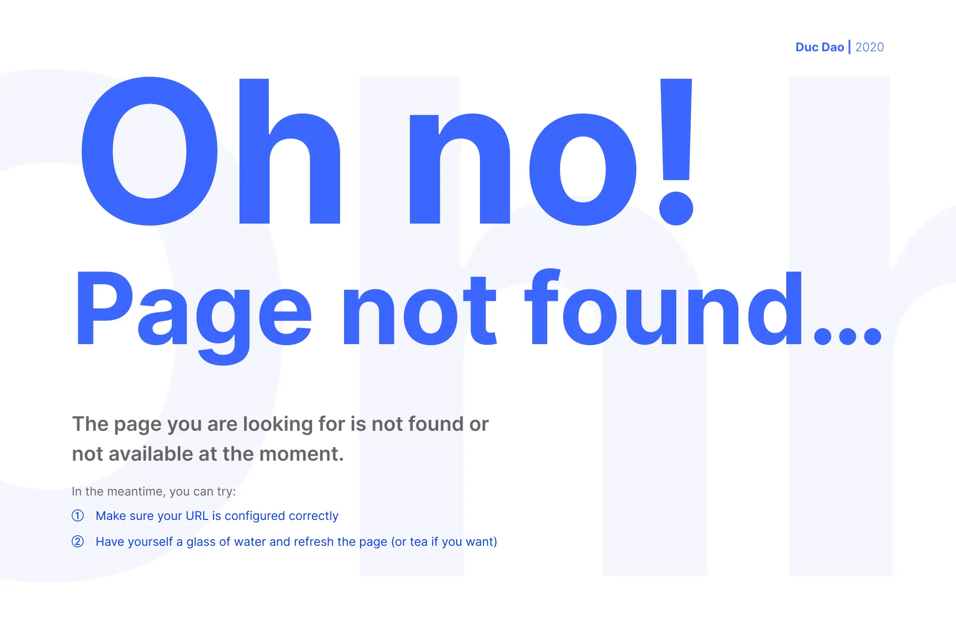
Error pages are where users land when something has already gone wrong. For GemPages, a Shopify page builder, I designed and animated a set of error states so that hitting one feels like a small, friendly pause instead of a dead end.
The idea
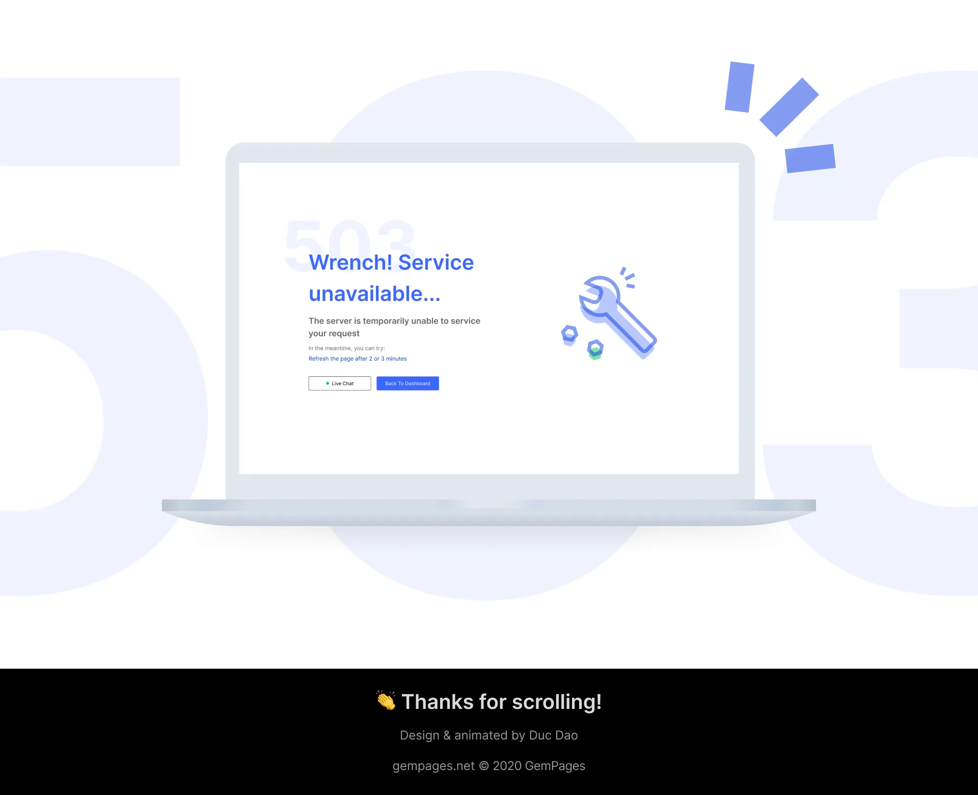
Each error gets its own illustrated icon in the GemPages blue, with a short loop that hints at what happened: a magnifier searching for a page that isn’t there, a wrench fixing an unavailable service. The copy stays plain and gives a next step, so the page is useful even before the animation catches the eye.

In context
The animation sits beside the message, never in front of it: headline first, then what to try, then a single way back to the dashboard.
One family of icons
The icons share one construction (rounded outlines, a soft offset fill, a single green accent), so the whole set reads as a family across every error state.